
Pages, components, state, actions, assets, and responsive behavior
Framework-neutral structure for the portions of the application managed visually.
Paneweaver Studio
Paneweaver brings interface composition, behavior, native integrations, imported source, cross-device continuity, libraries, GitHub review, and complete project export into one desktop-development workflow.
The product model
Paneweaver does not force the interface, source, native layer, and delivery workflow into one opaque representation.
Framework-neutral structure for the portions of the application managed visually.
Preserve handwritten source and explicitly define what Paneweaver does and does not own.
Expose desktop capabilities through reviewable configuration and owned extension points.
Keep the visual model continuous while source and releases move through normal engineering controls.
Product tour
One row of tabs controls one complete content and image region. Use the arrow keys or click any workflow.
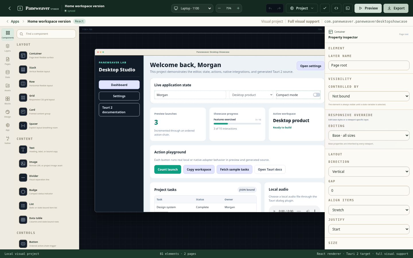
Visual application builder
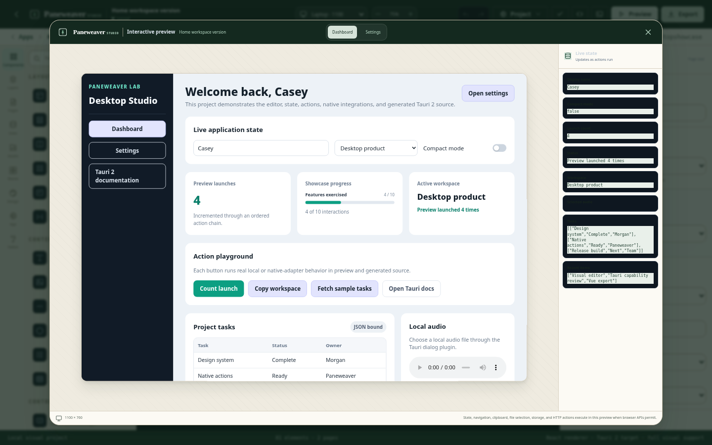
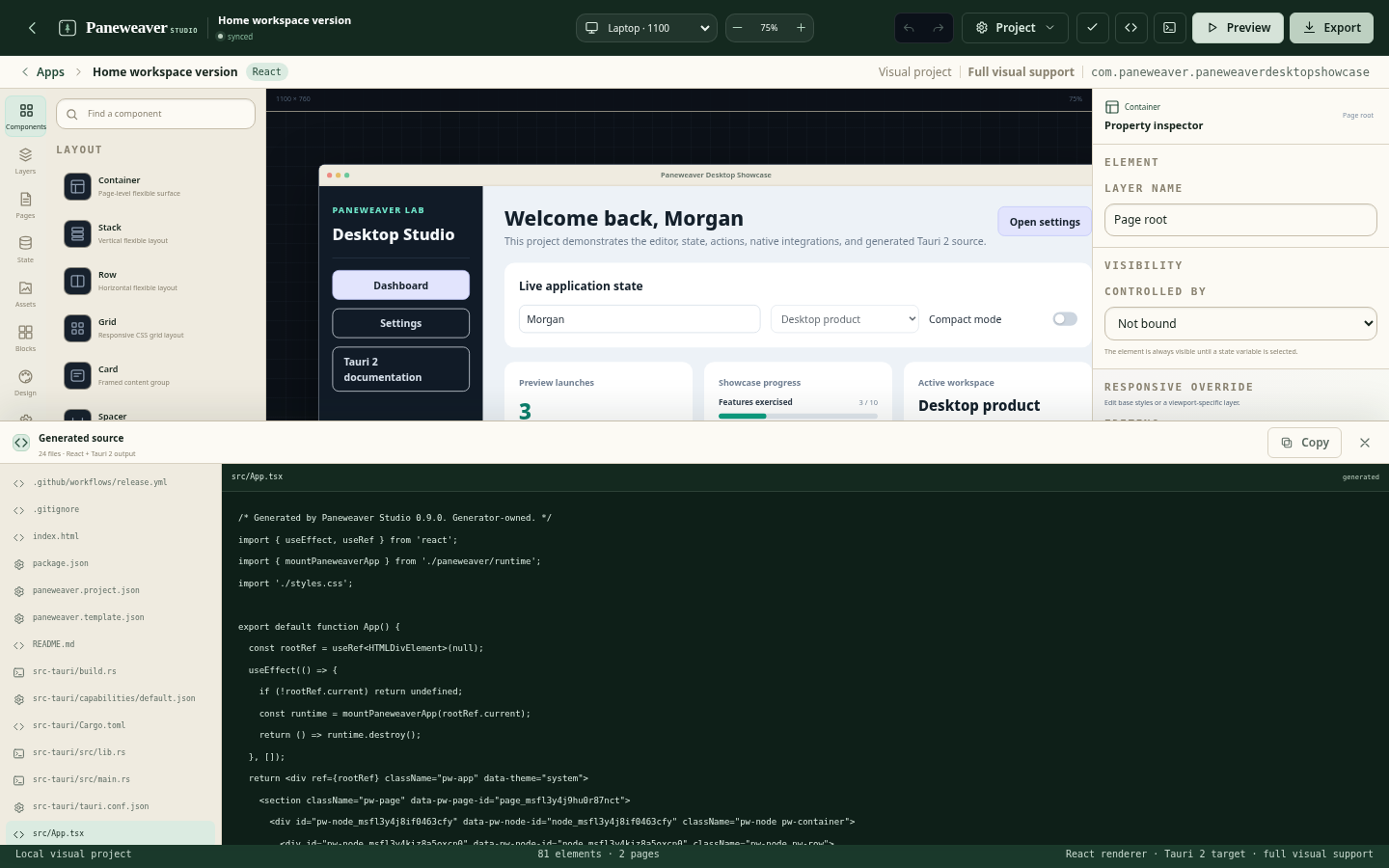
Build pages from 21 visual components, manage typed state, configure bindings and ordered actions, create reusable blocks, and tune responsive behavior in the preserved three-pane editor.
Visual builder
Pages, nested components, typed state, bindings, conditional visibility, ordered actions, assets, reusable blocks, and four responsive ranges remain part of the project model.
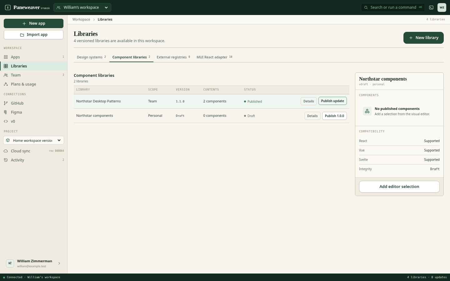
Design systems and libraries
Create design systems, framework-neutral visual libraries, framework-specific component packs, private registries, and MUI mappings that teams can reuse across applications.
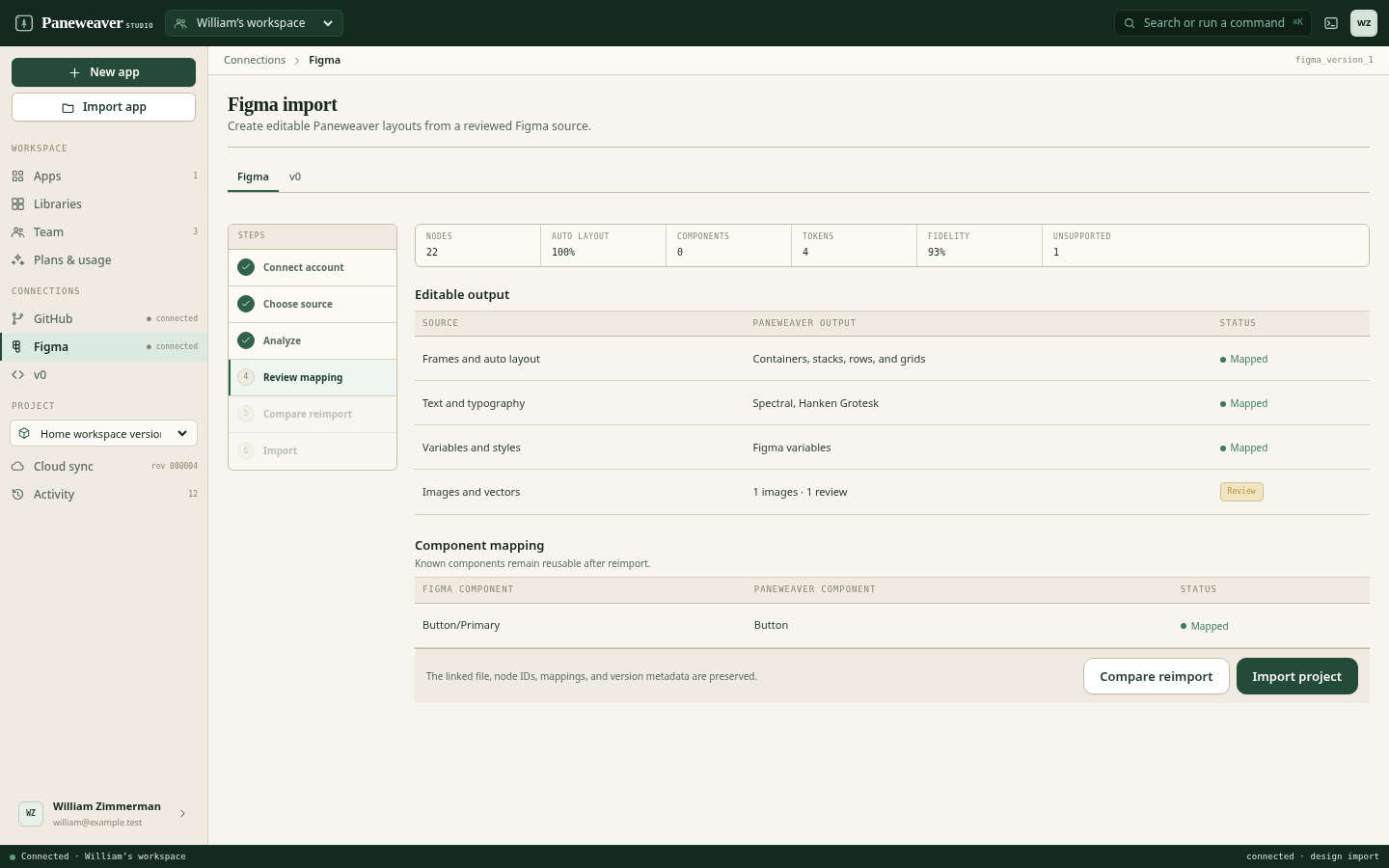
Figma and v0
Map known components and tokens, inspect editable coverage, preserve unsupported source in code-managed mode, and review additions, changes, and removals on reimport.
Source ownership
Generated source is not a hidden build artifact. Paneweaver exposes the framework tree, runtime, native bridge, Rust configuration, capabilities, assets, CI, and ownership labels.
Private beta
Applications with an existing frontend, repeatable team foundation, or defined native requirements are especially useful during the beta.